A Revamped San Francisco Home Infuses Hints of Both Past and Present
A design duo takes inspiration from history and beyond to transform a home in Cole Valley.
-
CategoryDesign, Homes + Spaces
-
Written byJennie Nunn
-
Photos bySuzanna Scott
-
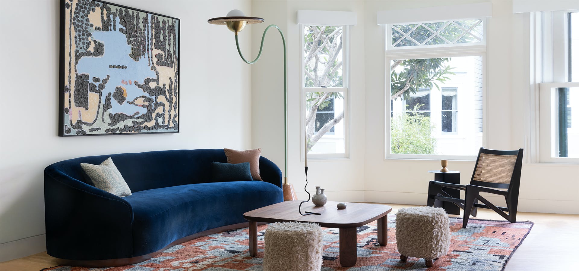
AboveA Cole Valley residence takes on a new look thanks to Jenny Magdol and Steffie Oehm of Alter Interiors in San Francisco.
When Jenny Magdol and Steffie Oehm, the duo behind San Francisco–based firm Alter Interiors, were tasked with refreshing a four-bedroom single-family home in Cole Valley with new furniture, lighting, art, and styling, they knew they wanted to create a sense of place and a customized design plan based on a very specific set of questions. “One of the first things we do when we onboard a new client is create a customized design questionnaire for them,” says Magdol. “It is through this process that we really get to know our clients and their likes and dislikes. A question we ask everyone is, ‘If you could choose any time period to live in, which would it be?’ In the case of this particular project, the responses included the 1960s, the present, and the future, which inspired the ‘2060’ concept that we brought to life.”
Using natural materials and local art and accessories, the designers transformed the home into a “2060” refuge with interesting textures and layers. “We took a lot of cosmic inspiration for forms and textures,” adds Oehm. “At the same time, we wanted the space to convey a strong sense of place, so we incorporated lots of local art and furniture from brands and artisans that we admire.”
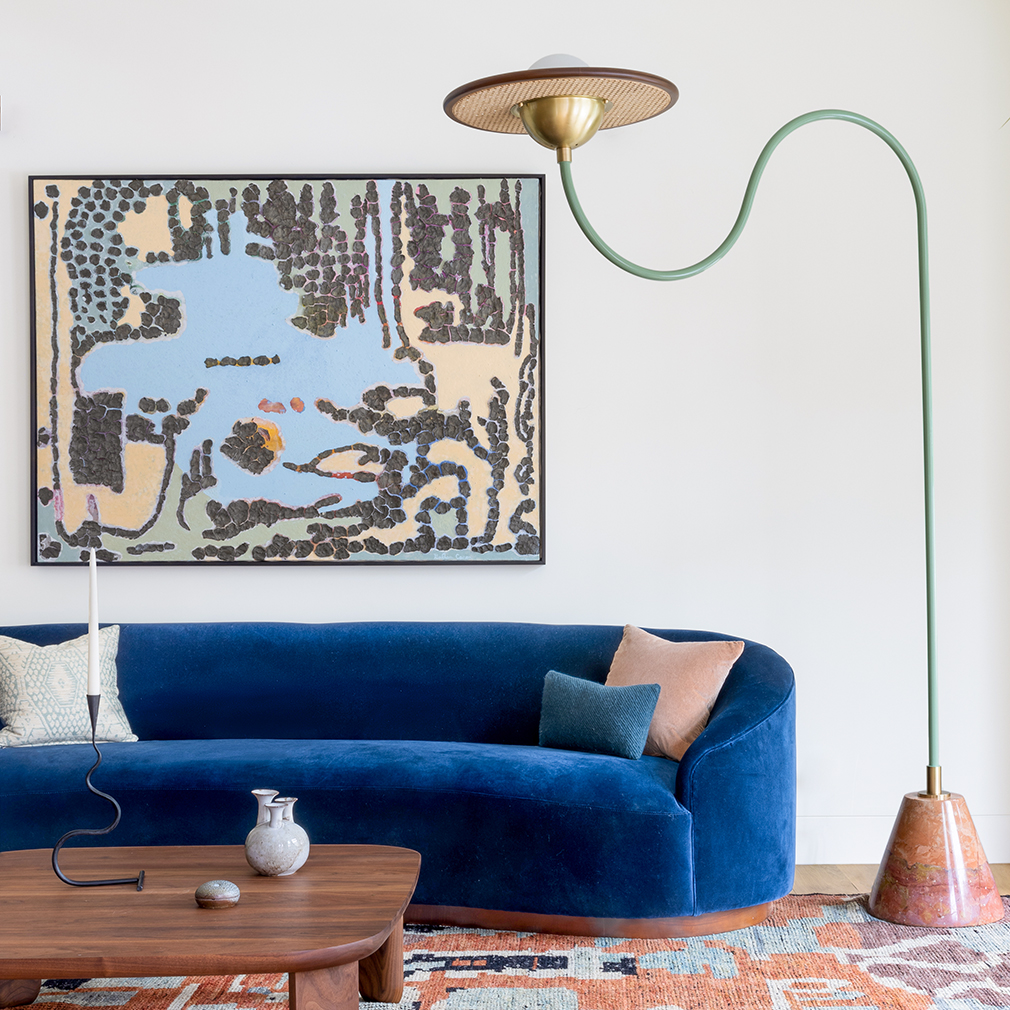
For the open-concept main living area, they wanted to create visual connections between the entry, front parlor, dining room, and family room. “While we aimed to create distinct areas, we also wanted to unify them as one cohesive space,” says Magdol. “The front parlor exudes warmth, with oxidized reds reminiscent of a deep blue velvet sofa that evokes the night sky. The art in this area features an aerial view of the artist’s hometown lake, with black clay sourced from the surrounding earth. As time passes, the clay will gradually fall away, revealing an underlying painting and symbolizing the evolving earth. The room’s atmosphere transports you to the night sky as if you are gazing down on the earth.”
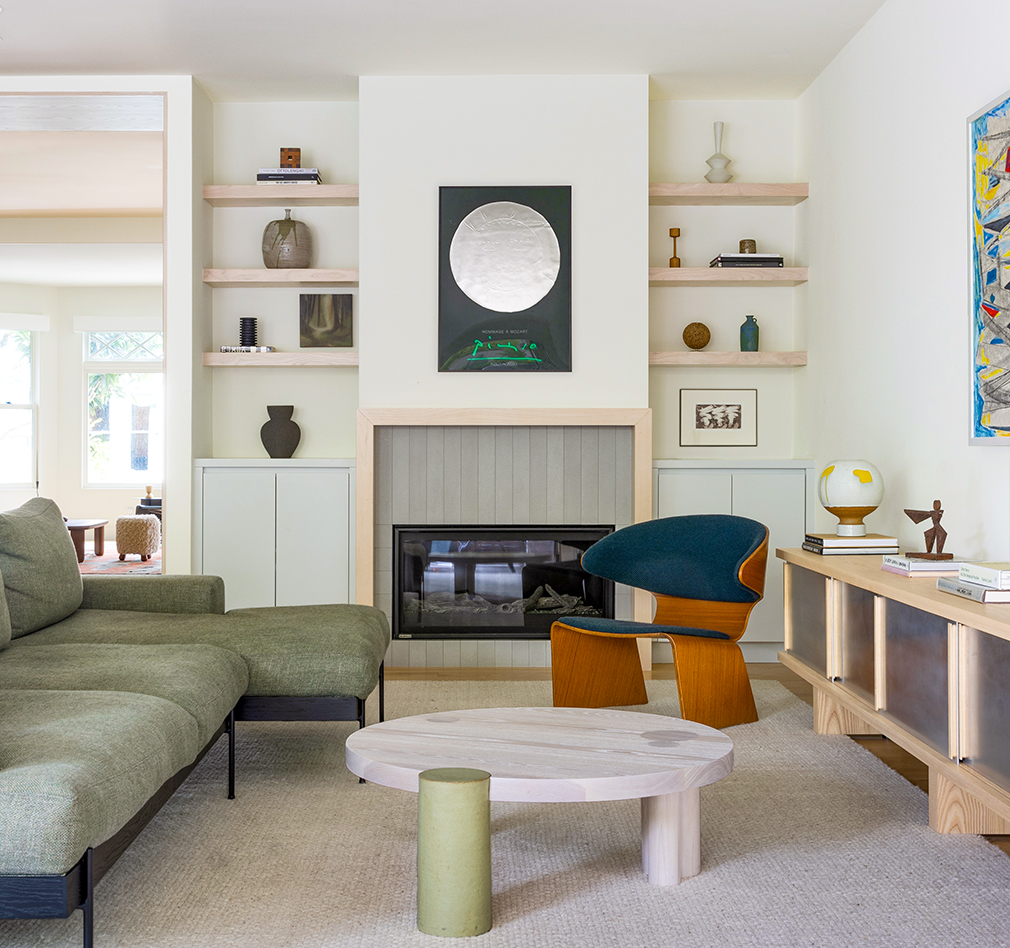
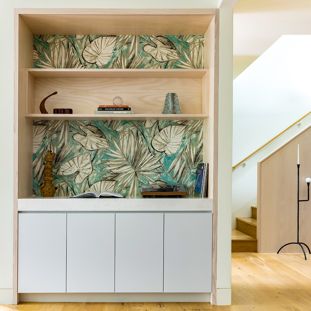
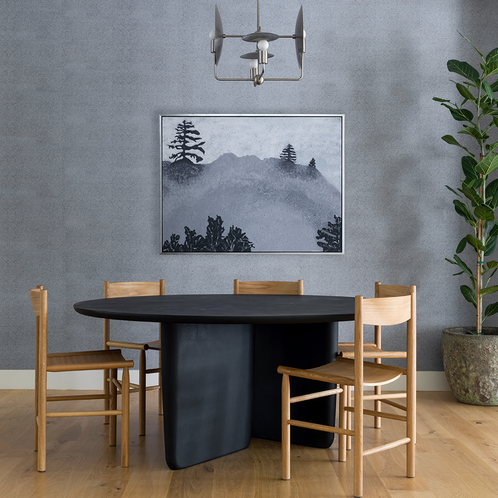
To create contrast, they transformed the dining room with elements evocative of a forest. “The dining room feels like a northern California forest at dusk, with cooler tones and a view of the rising moon,” adds Oehm. “The family room, the sunniest space, features greens and yellows that connect to the outdoors. Throughout the day, you can move through the spaces, spending time in the family room during the day, hosting dinner, and ending the night with a nightcap and a record in the parlor. The bedroom, located on the top floor, feels like a tree house and allows you to ‘sleep under the stars.'”
Magdol and Oehm sat down with SHLTR to chat about their top spaces and more about the design inspiration.
Tell us about the project and how you got involved?
SO: The clients initially reached out to us with a shared passion for design and architecture, as well as remarkable design thinking, but didn’t know how to translate their vision into physical space. It was a great match from the start.
What is the backstory of the home.
JM: The home is in Cole Valley, the smallest neighborhood in the city located between Haight Ashbury and the Sutro Forest, and was popular with dot-commers in the ’90s. All these elements are reflected in the design: the 60s, cosmic space, technology, and an overall northern California feel to the aesthetic.”
Personal favorite spaces?
SO: “I love the front parlor so much. I think the concept is so strong, without being obvious. The deep blue hue of the sofa, the Saturn-inspired lamp, and the artwork featuring an aerial view of a lake transport you up into the night sky. It’s the perfect room to unwind in after a long day.”
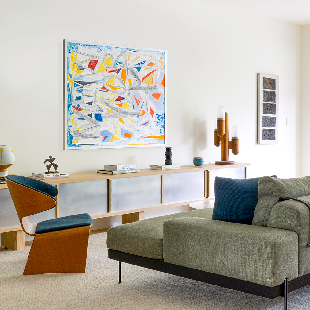
JM: “My favorite space is the informal family room. While the front parlor evokes the night sky, the family room reflects the glow of the sun. Warmer green tones and yellow bring a sunlit feeling to the space, and the custom ash and aluminum console ground it. I love how the aluminum softly reflects the light.”

Overall design take?
SO: All the elements have been chosen with so much care and are either custom or vintage. Our clients were really into the history of the individual pieces, and it was important to them to feel a connection to the piece and know who made it. I also love the sense of time the design reflects. It pays homage to the space age while clearly being of ‘the now’ and future-forward. The family room, dining room, and parlor follow the trajectory of the day. The family room represents daytime, the dining room dusk, and the parlor the night.
Most memorable pieces in the home?
SO: The art in the front parlor. The land portion of the aerial view is made from clay from the actual site of the lake. There is an underpainting that will reveal over time as the clay will fall off. I love that this is evolving just like the surface of the earth would.
JM: The hollowed-out bench in the entryway, which we found at an auction, serves as a functional sculpture. Just after the bench was installed, our client sent a photo of their 2-year-old daughter climbing through it. This playfulness is what it’s all about.

6 Family-Owned California Wines We Are Thankful For
Shop local for your holiday feast!
How to Make a Passion Fruit Sour
Mixed Messages travels to Maui for inspiration on our latest cocktail recipe.
A San Diego Exhibition Traces the Historic Legacy of African American Women
On view through December.
Get the Latest Stories


