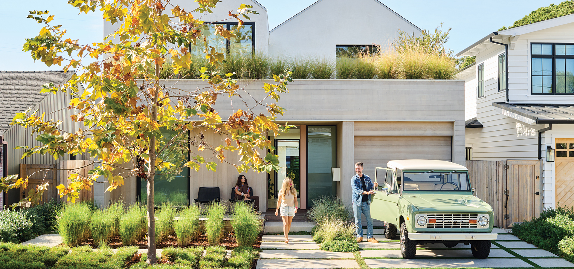
A Music-Minded Couple Finds the Ideal Home and Rebuilds for Their Lifestyle
Perfect timing.
-
CategoryArchitecture, Design, Homes + Spaces
-
Written byJennie Nunn
-
Photographed byLauren Taylor & Here and Now Agency
For homeowners Kris and Ginger Pooley, the journey to finding and reinventing a home came down to mere timing. Twelve years ago the couple was living in a loft in Downtown Long Beach. They realized they needed not only a space conducive for writing music (he’s a music director and composer, and she’s a songwriter and bass player), but a neighborhood better suited for their new lifestyle with a newborn.
“We always loved Manhattan Beach,” says Ginger. “We are surfers, so we also longed for a surfable beach town.”
After searching online for a rental, Ginger found a two-bedroom, one-bath home built in 1946 in the Tree Section that checked all of the boxes. “I was the first person to email about it and the first person to see it the next morning,” she recalls. “We signed the lease that day. We just loved our landlords and the neighbors. We daydreamed that first year about being able to buy it.”
As luck would have it, at the end of that year they were the proud new owners. For the next several years, they lived in the house as is but contemplated a remodel to accommodate their growing needs. They wanted extra room for out-of-state friends and family to stay with them while visiting.
“The existing house was great with a big yard, but at just over 800 square feet we were outgrowing it,” adds Kris. “I was working in the single-car garage as a makeshift studio. It was pretty tight—and not in a good way. But fun fact, I did make most of Katy Perry’s Super Bowl XLIX halftime performance in that little garage.”
“We thought, ‘Let’s keep things classic and simple and timeless, and they can procure the space as they need to and as their needs evolve or change.’”
To help bring their design vision to life, they looked to Robert Sweet, principal and general contractor of ras-a studio, whom they discovered had designed one of their favorite homes in the area. “There is a beautiful, modern house in Manhattan Beach that we would drive by every morning after school drop-off,” explains Ginger. “One day I asked the owner who designed it, and the rest is history.”
Kris and Ginger knew they wanted more space, but they also wanted to honor the integrity of the original home. They even handed over an admittedly “poorly drawn” sketch of the double-A-frame style they dreamed up to Robert.
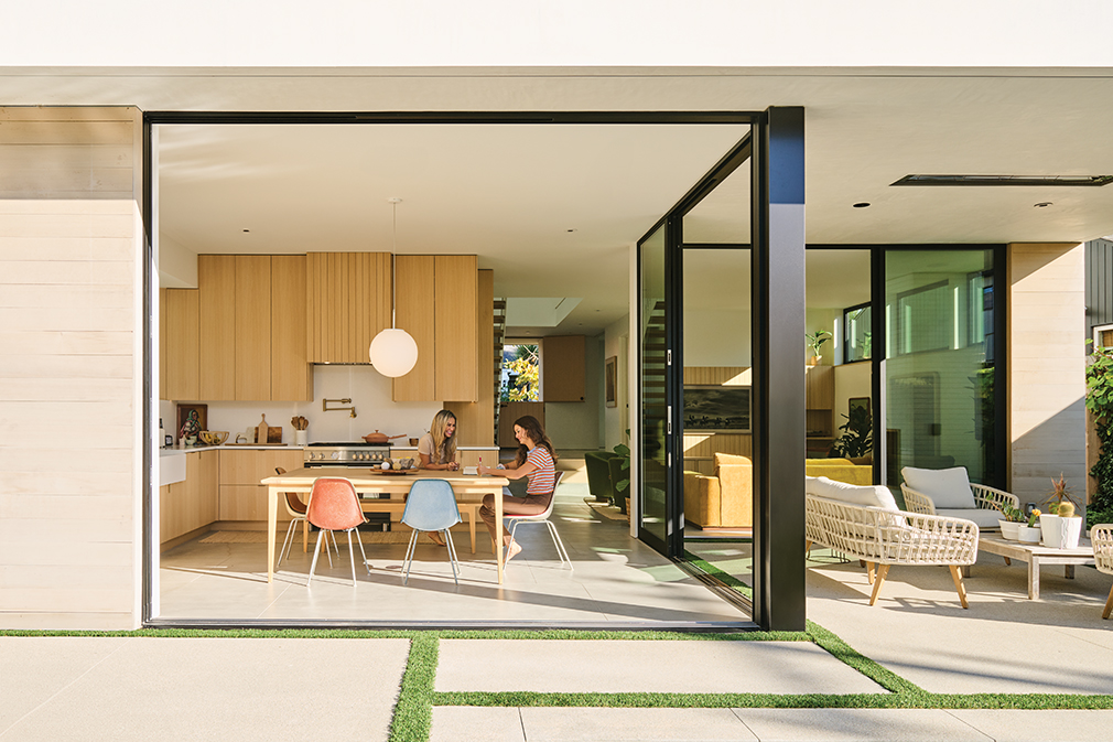
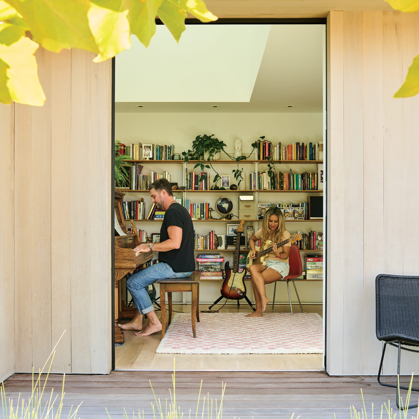
“After living in the original home for so long, I had grown an emotional attachment to it,” adds Kris. “We liked the look of the single-car garage door, so we went with a tandem garage space. From the entryway, we wanted the space to flow into the backyard and feel like indoor-outdoor living. When living in the original home, our backyard space was very important to me. I wanted to honor that as much as possible, which I think we did by having all glass sliders in the back. You feel connected to the outside when you are in the kitchen and living spaces.”
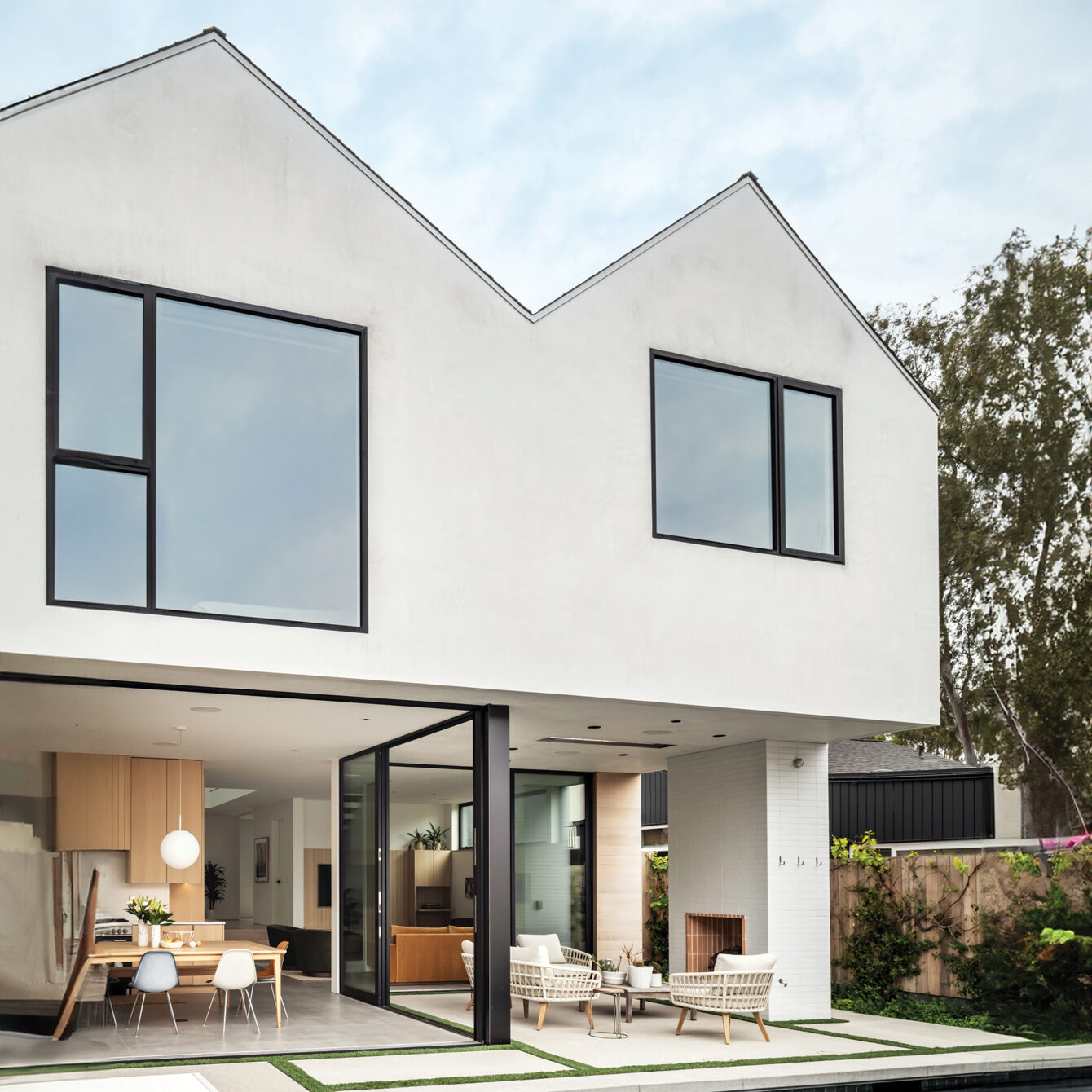
For the two-story, approximately 2,400-square-foot home—a complete ground-up project—Robert selected western red cedar and white stucco for the exterior. Design plans also included three bedrooms upstairs along with a reading room, laundry area, two bathrooms and a terrace; a covered patio; dark bronze aluminum sliding glass doors that line the kitchen and music room on the first level; and a swimming pool.
“We like western cedar because it gives it a nice warm, beach vernacular and represents its locale. The white stucco is economical and is a very good sustainable material when you’re this close to the coast, and that’s what dictated the palette,” says Robert. “They wanted to keep the footprint minimal with plenty of yard space. The geometry of the house is twin gables, which helps reduce the scale of the house. There are a lot of single-story homes in the neighborhood, so it’s respectful of the neighbors.”
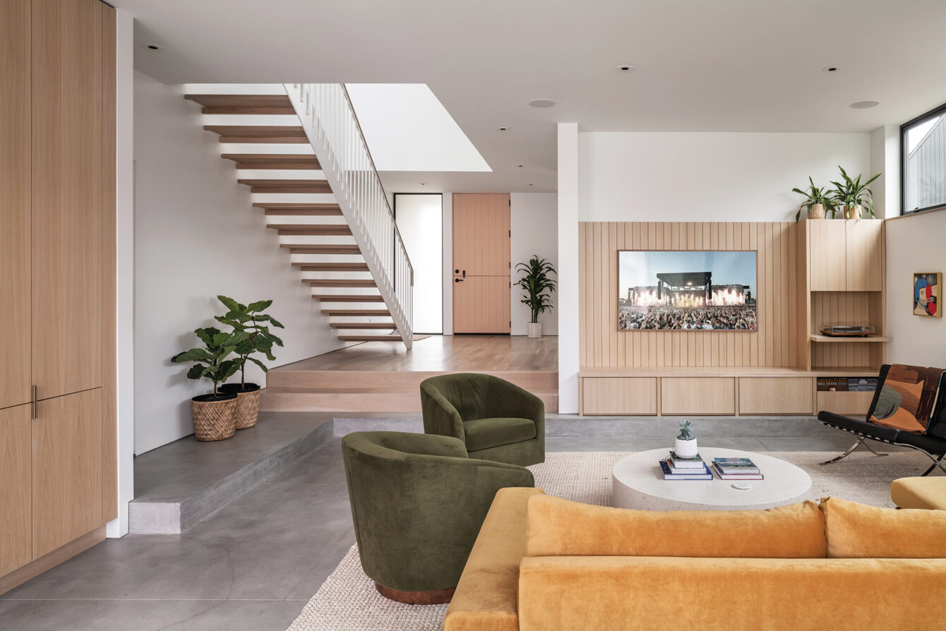
The two-year-long project—which included work by landscape designer Rob Jones, site supervisor Bill Spice and structural engineer Eric McCullum—is now lined with fresh white walls (Pure White by Sherwin-Williams); white oak cabinetry casework and flooring throughout with a matte clear finish; and glass globe pendant lighting.
“We thought, ‘Let’s keep things classic and simple and timeless, and they can procure the space as they need to and as their needs evolve or change,’” adds Robert. “The pendants and bathroom sconces have such a great shape and add a nice softness and fantastic light, so we repeated that in the kitchen as well as above the dining area. And for the lining of the outdoor fireplace, we took a standard off-the-shelf fire brick and had our mason split them lengthwise [in long skinny tiles] to play with their proportions. We chose that color because we liked the terra-cotta quality of it, and it matched the palette very well. We like to get creative with simple materials so it feels a bit more unexpected.”
The interior is an artful compilation of Kris and Ginger’s combined style. “We wanted to go a little bit quirky in the bathrooms but for the architecture itself to be the main attraction throughout the home,” explains Ginger. “We wanted to stick with natural tones for the palette and include a few wild moments here and there. Our Wren Ceramics face vases and Kartell Attila side table by Philippe Starck are good examples. We had a friend (and great drummer), Adam Christgau, build us a table. We’re big fans of having things in the home made by people who love what they do.”
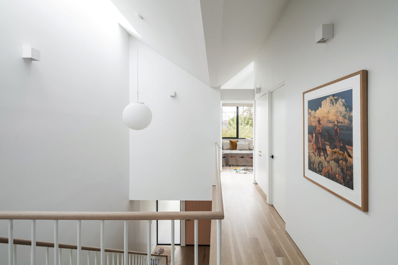
A sofa by Joybird and dining table chairs from Herman Miller are Craigslist finds, while wall art is a blend of pieces culled from vintage stores and estate sales, as well as works by Tyler Hays of BDDW and prints by New Mexico–based artist Mark Maggiori.
Other intentional design touches include a black-and-white terrazzo tile floor by Concrete Collaborative in the primary and guest bathrooms; an outdoor shower for rinsing off after surfing or swimming; rose-hued porcelain tile by Daltile for the daughter’s bathroom; and an oversized dining table in lieu of a kitchen island.
Even now after the project is complete, the couple and their daughter can’t stop reveling in their new home. “It was fun finding that old drawing after the house was finished and seeing that the drawing was actually pretty close to what we had built. Somehow Robert translated that drawing into an actual house,” says Ginger. “We still pinch ourselves. I love all the light in our home and the way the shadows change throughout the day. I love the view into our backyard and how the skylights frame a blue sky with white, puffy clouds. Waking up and seeing birds fly by above our heads feels magical.”
Kris chimes in: “The way light plays in the house is incredible. We catch ourselves stopping and staring at something beautiful in the home nearly every day.”
Mendocino Wants to Take You to the Edge
Dystopian banquet and topless tapas, anyone?
This Woman Set Out to Run Across California
A friend documented the journey on film.
SoCal Brothers Share a Passion for Surfing
El Porto siblings Beck Cherry and Cash Cherry live to surf, and they’re putting in the time required to become the best.
Get the Latest Stories


